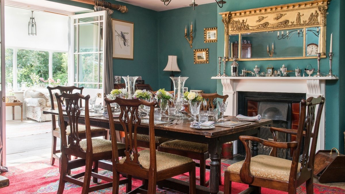
The dining room serves as the most expressive space in a home, where color choices shape its character and atmosphere. Unlike other rooms, it demands hues that balance warmth, light, and architectural detail to create a setting for both daily meals and special gatherings. The right palette can transform a simple eating area into a space that feels intentional, whether in a grand manor or a cozy cottage.
Dark Tones for Intimacy and Drama
Deep midnight blue remains a reliable choice for creating a moody, inviting backdrop. This shade thrives in historic townhomes with high ceilings and detailed moldings, where its richness enhances the room’s grandeur. Pairing it with warm mahogany furniture, brass accents, and forest-green leather upholstery reinforces its sophistication.
Terracotta and sun-bleached peach offer a contrasting warmth, ideal for English country homes and stone cottages. These earthy tones absorb natural light, adding tactile depth without overwhelming the space. Layered artwork, vintage wood furniture, and patterned rugs complement the scheme, reinforcing its lived-in charm.
For those who prefer lighter options, duck egg blue and seafoam green provide a serene, airy alternative. These soft pastels reflect light effectively, making them suitable for coastal homes or sunlit interiors. Dark mahogany chairs, crystal chandeliers, and floral drapes help anchor the palette while maintaining elegance.
Rich Reds and Emeralds for Regal Elegance
Oxide red and deep burgundy evoke the warmth of a private library, encouraging conversation and lingering meals. Woven lamp shades, natural oak wood, and rustic terracotta tiles balance the boldness of these tones. The color works particularly well in historic homes and rural cottages.
Emerald green paired with crisp white wainscoting delivers a high-society touch. The contrast sharpens architectural details, while glossy dark woods, silver serving platters, and crystal chandeliers complete the luxurious feel. This combination suits spaces where grandeur is a priority.
Related Post: Modern Scandinavian Home Shines in Texas Hill Country
Warm creams and buttermilk tones avoid dullness when paired with rich undertones. Antique gold frames, marble mantels, and velvet textiles raise the look, making it ideal for period homes. The soft background highlights furniture and artwork without competing for attention.
Natural Greens and Sunny Accents for Timeless Appeal
Sage green bridges indoor and outdoor spaces, fitting seamlessly in country estates, barns, and period cottages. Natural sisal rugs, lattice-back chairs, and modern lighting keep the look fresh while maintaining a relaxed atmosphere.
Sunny yellow or warm gold paint introduces brightness and energy, perfect for old-world manor houses. The color enhances morning light and candlelit evenings, while forest-green velvet drapes add opulence. This pairing works well in spaces where warmth is key.
Moss green provides depth without overpowering, making it a favorite in historic homes. Heirloom ceramics, brass sconces, and warm oak antiques complement the shade, emphasizing original woodwork while keeping the room grounded.
A teal-toned slate blue, such as the shade Blue Gum from Paint & Paper Library, offers a contemporary twist. Punchy orange or coral upholstery contrasts effectively, while warm wood furniture and paper lanterns complete the look. This palette suits modern townhouses and eclectic period spaces.
Practical Considerations for Color Selection
Bringing a color scheme to life requires balancing texture, scale, and function. In smaller dining rooms, mirrored surfaces or drop-leaf tables maximize space without sacrificing style. Lighting plays a key role—dimmable pendants and layered table lamps allow mood adjustments as the evening progresses.
