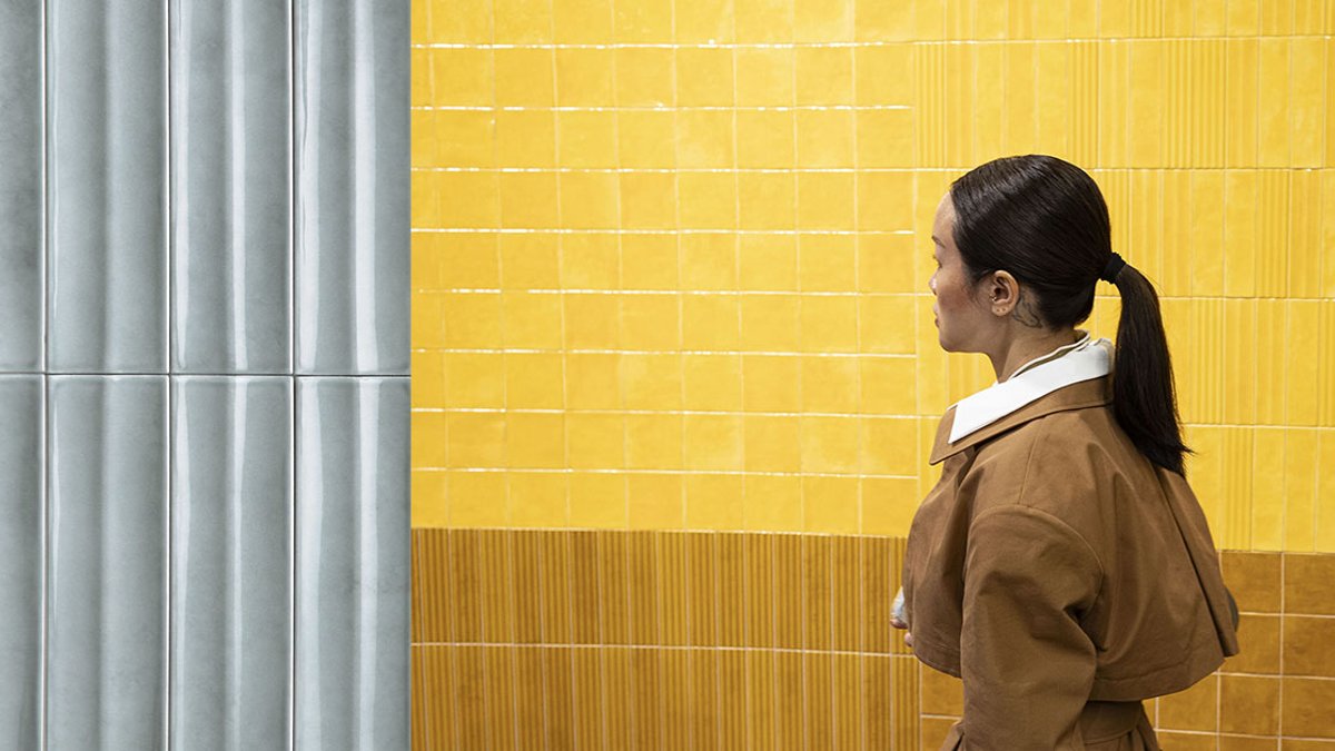
The porcelain stoneware collection SensiColore, created by Matteo Thun & Partners for Florim, takes inspiration from Johann Wolfgang von Goethe‘s 18th-century Italian travels. The designer observed how the writer captured the country’s varied scenery through color, translating those findings into 15 distinct hues grouped into five chromatic families. Each shade corresponds to a specific Italian region, ranging from the pale white of Sicily’s Scala dei Turchi to the rich blues of Lombardy’s lakes.
The palette moves beyond the rigid uniformity of standard color charts by combining precise decoration with a textured, watercolor-like finish. This method produces subtle color variations across each tile, replicating the natural irregularity found in handcrafted work. The effect creates surfaces that change with light, displaying different tones depending on the viewing angle.
The collection features compact formats, 57 x 232 mm and 116 x 116 mm, reinforcing its handmade character. Designers incorporated multiple graphic variations to allow flexible arrangements: adjacent tiles can create striking contrasts, a single blue stripe may divide a field of ivory, or a monochromatic installation can let natural light play across the surface. Glossy finishes enhance the depth of the tiles.
Unlike short-lived tile trends, SensiColore draws from timeless environments. For example, the Tuscan hills have preserved their colors for centuries, and the collection aims to mirror that lasting quality. By anchoring its design in Italy’s natural scenery rather than passing fashions, the series ensures its enduring appeal.
Read Also: Berlin restaurant adopts its imperfections
This design philosophy aligns with a larger trend in ceramic production, where authenticity and regional roots matter more than fleeting styles. The tiles’ uneven surfaces, small-scale patterns, and ties to specific locations give the product both a lasting quality and a distinctly Italian identity.
Florim’s earlier Sensi series, including SensiTerre and SensiEtna, also drew from natural elements but focused on textures and volcanic terrain. In contrast, SensiColore directly interprets Goethe’s observations, turning his chromatic journey into a physical, installable surface.
The tiles use porcelain stoneware for strength while retaining the soft, organic feel of their inspiration. The watercolor effect serves a practical purpose, allowing each piece to interact dynamically with light and space. This adaptability makes the collection ideal for both homes and commercial settings, where its flexibility can meet diverse design requirements.
